
Rich Festivities™
Project Summary
Client / Brand: Rich Festivities™
Year: February 2026
Role: Art director, Graphic Designer
Duration: 8 weeks
Sector: Premium Confectionery, Festive & Seasonal Gifting
Discipline: Naming, Logo design, Brand guidelines, Package Design, Social media, retail POS.
Tools Used: Adobe Illustrator, InDesign, Photoshop, and Acrobat.
Objectives
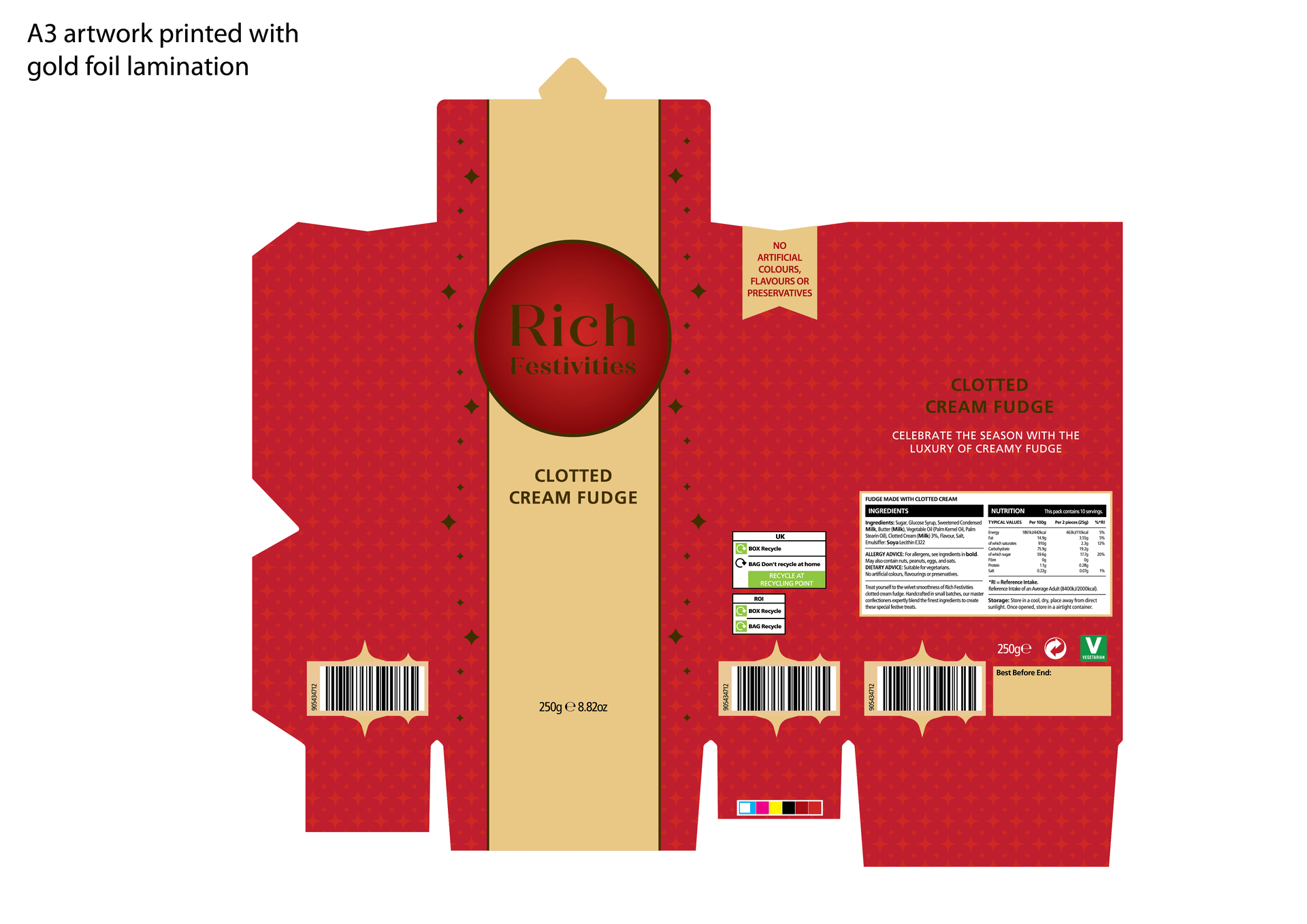
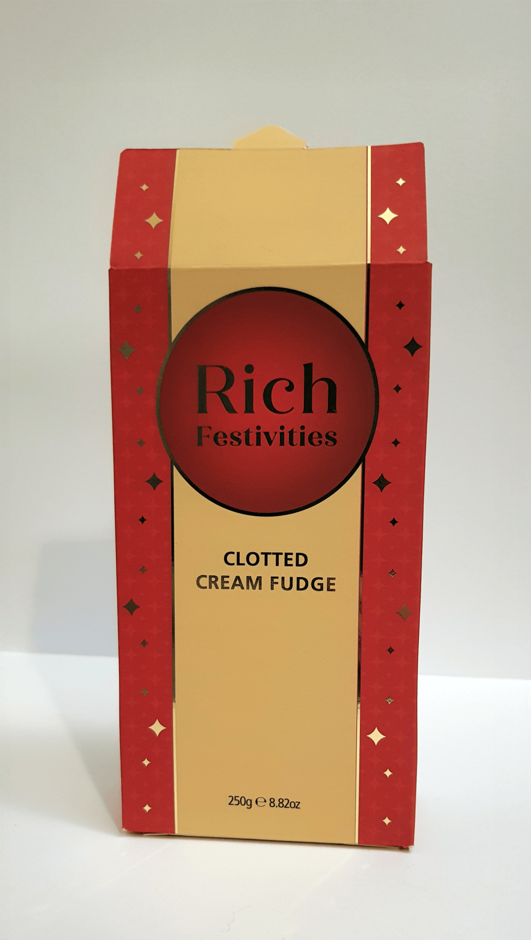
One of my goals for this project was to experiment with packaging design and embossing gold foil onto a design.
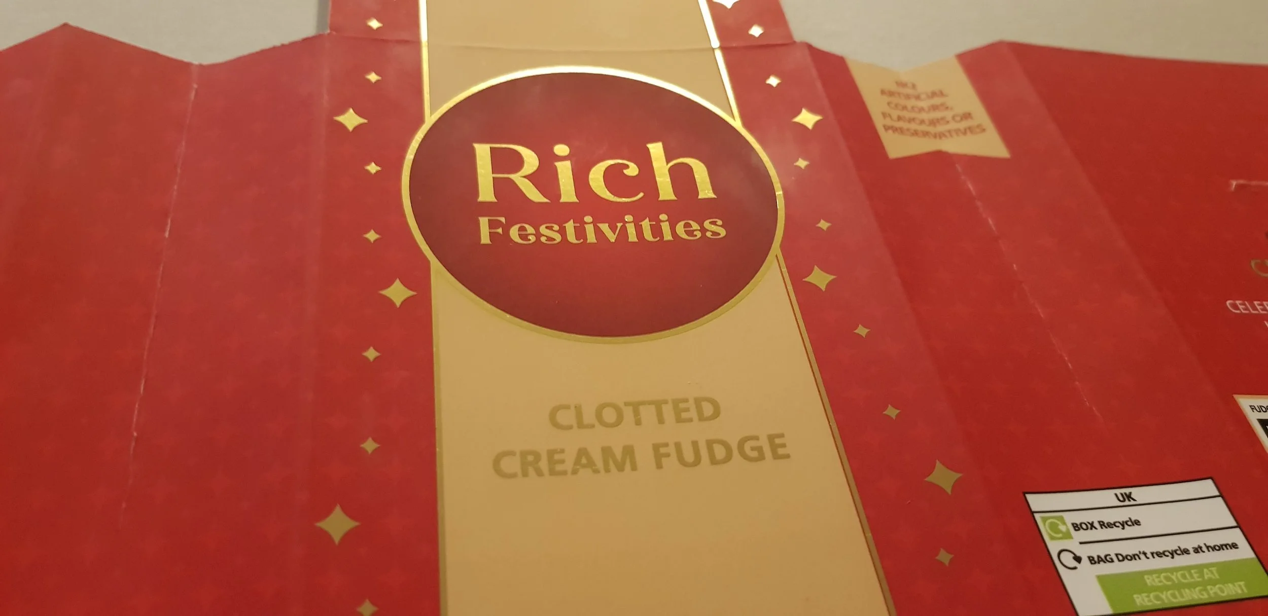
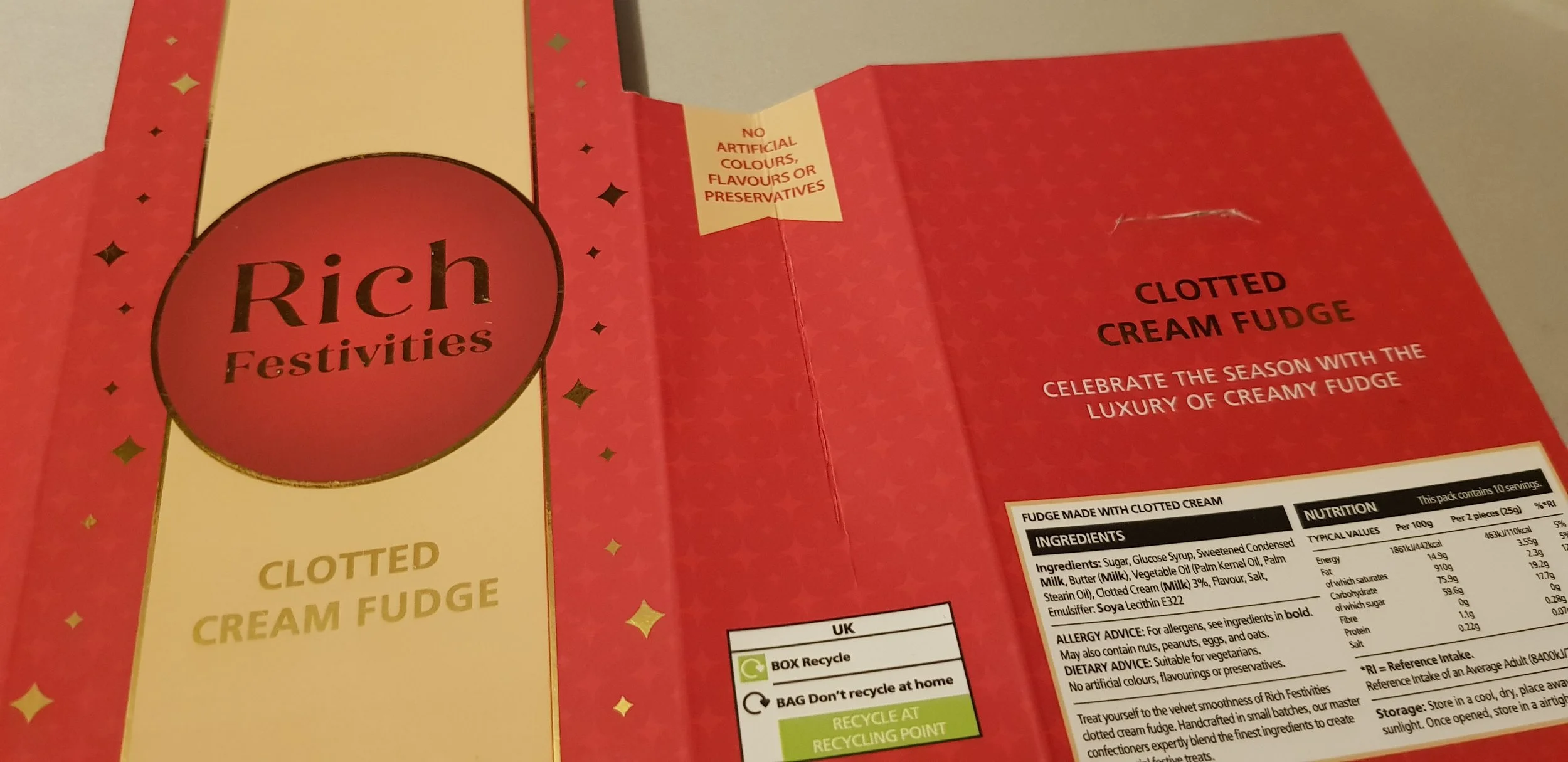
Logo, brand guidelines, and packaging design for Rich Festivities™, a clotted cream fudge brand celebrating indulgence, festive warmth, abundance, and the joy of gifting.
Objectives
The goal of the project was to establish a premium brand identity that conveys indulgence, quality, and tradition while presenting Rich Festivities as a modern yet timeless confectionery brand. The packaging was designed to feel festive, gift-worthy, and visually distinctive, standing out both on retail shelves and digital platforms.
The visual language balances nostalgia with contemporary luxury, integrating heritage-inspired motifs and refined details to create an enduring sense of elegance. Every element was crafted to highlight authenticity and communicate the handcrafted, small-batch nature of the fudge. Storytelling and sensory design cues were used to evoke warmth, celebration, and comfort, strengthening emotional connection with consumers. Finally, the identity was built with versatility in mind, adaptable across packaging formats and seasonal collections to ensure a cohesive brand presence year-round.
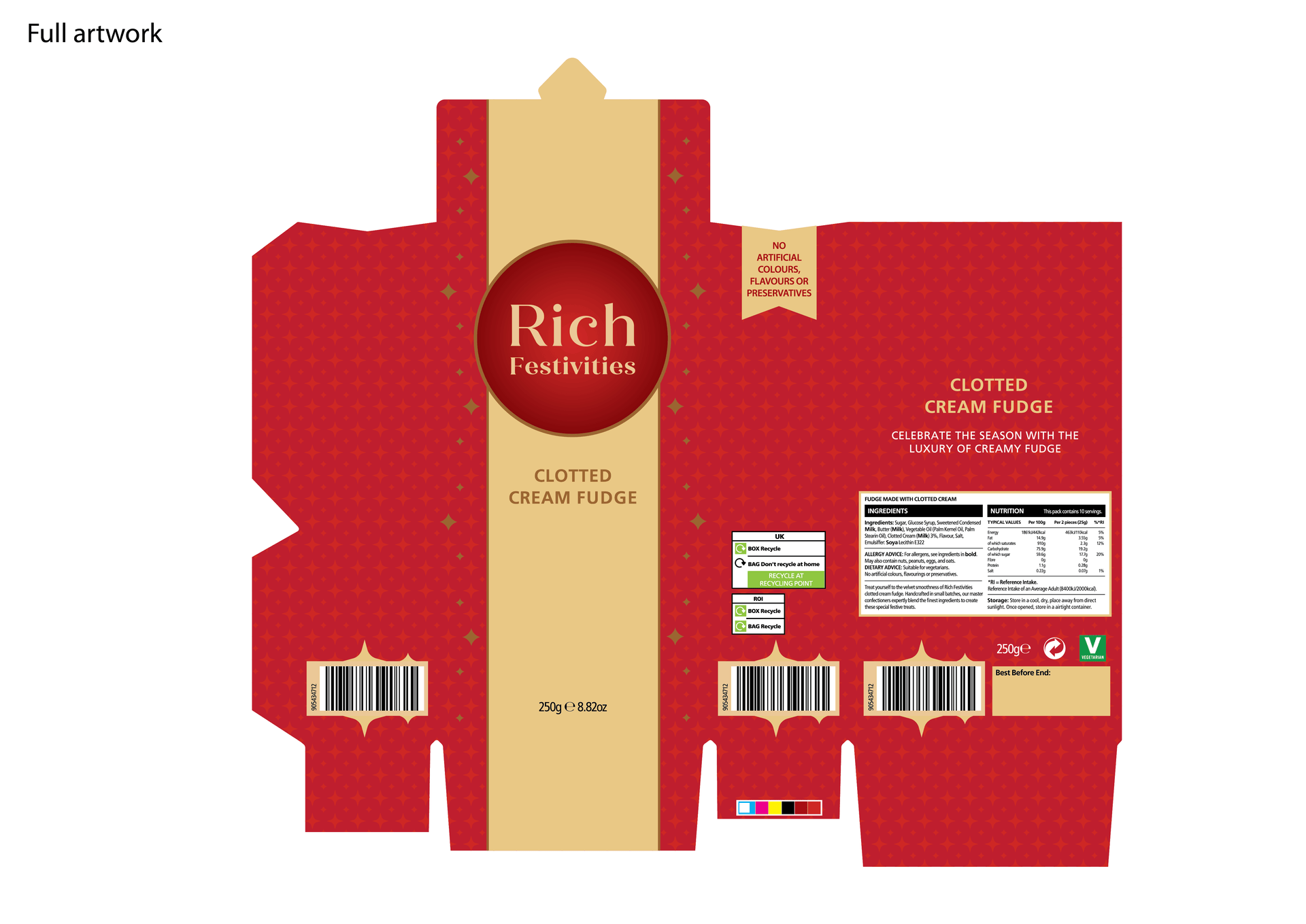
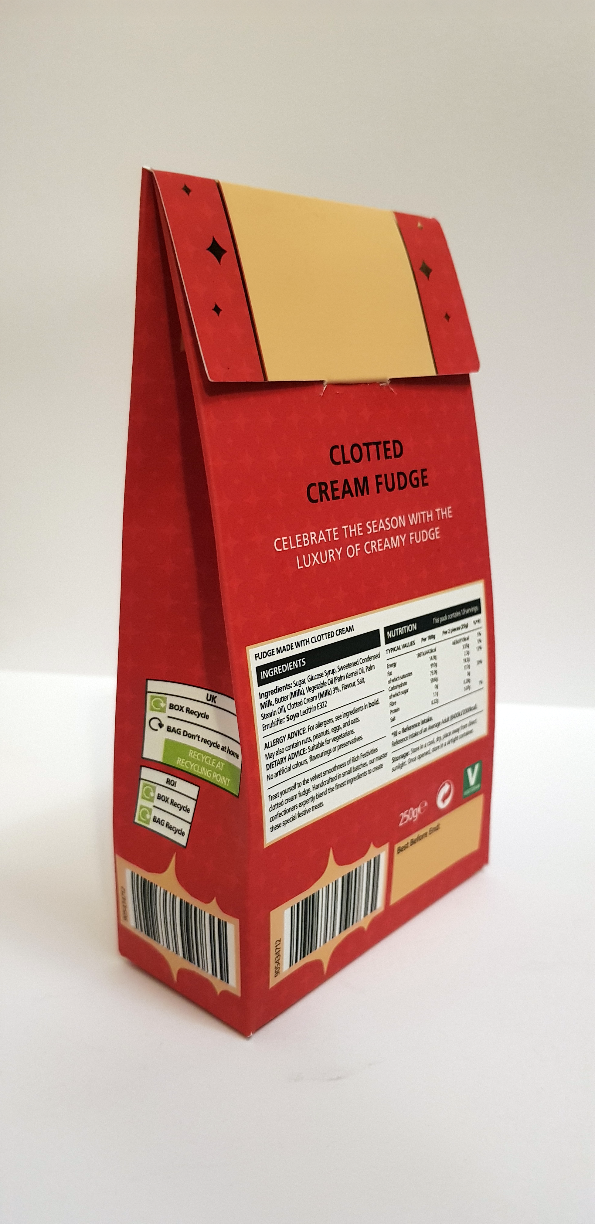
Logo design presentation and packaging designs x4
Project Overview
Rich Festivities™ is a premium confectionery brand that specialises in traditional clotted cream fudge, inspired by celebratory moments, and the joy of indulgence. The brand captures the essence of luxury and warmth, positioning fudge not just as a sweet treat but as an experience of celebration and craftsmanship.
The visual identity and packaging were developed to embody richness, festivity, and authenticity, appealing to modern consumers seeking a giftable, artisanal confection. Through elegant design, refined typography, and a luxurious color palette, Rich Festivities communicates both heritage and contemporary sophistication, reflecting the smooth, creamy decadence of its signature product.
Logo presentation
Brand guidelines sheet
Instagram page with 24 social media posts seasonal campaign templates
Point-of-Sale & Retail Marketing Materials: Shelf talkers x1
Digital ads
Conclusion
This project demonstrated how thoughtful branding and design can bring a new product to life by combining culture with storytelling. Through the beer bottle label, custom coaster, and packaging design, Malthall Craft’s identity was established as a craft beer that reflects Scotland’s heritage while resonating with a modern, global audience.
Design Approach
I began the design process by drawing inspiration from the natural landscape of the Scottish Highlands the rugged terrain, misty hills, and traditional Highland cattle. To ensure authenticity, I used original photography captured during a family trip to the Highlands as visual references.
I also researched modern craft beer design trends, particularly minimalist illustrations, while placing emphasis on strong typography for the logo and strapline. I focused on type scaling and hierarchy to ensure legibility and balance at smaller sizes, aligning the design with both function and aesthetics.
The visual identity was built around a warm, rustic palette of deep browns, amber tones, and muted greens, reflecting the Highland environment. A Highland cow illustration, created in Adobe Illustrator, became the brand’s central symbol, representing strength, character, and heritage. To balance tradition with modernity, I paired Acumin Pro, a clean sans-serif, with Baskerville, while using Allura for the signature wordmark.
As part of my design thinking process, I produced multiple printed label prototypes to test colour, scale, and how the design wrapped around the bottle. Rather than a single wraparound, I developed a two-label system, which required careful experimentation with composition and typography.


Socials and marketing examples
Outcome
To extend the identity beyond packaging, I designed supporting collateral including a custom coaster, website, and comprehensive brand guidelines.
The final beer bottle label authentically reflected Malthall Craft’s Highland roots while standing out in the craft beer market. The custom-designed coaster reinforced the brand in physical spaces, helping to build recognition and spark conversation.
Together, these elements formed a cohesive design system that translated seamlessly across packaging and promotional materials, ensuring consistency and strengthening the brand’s overall presence.
Results
The project successfully established a strong visual identity for Malthall Craft’s 2025 launch, positioning the brand with a distinctive and authentic presence. Drawing inspiration from the Applecross Highlands, the designs created a narrative that emotionally resonated with consumers and reinforced the brand’s origin story.
By introducing both the bottle label and custom coaster, the customer experience was enhanced through memorable touchpoints that encouraged recognition, engagement, and long-term loyalty.